
Fix Color Grading Mistakes: Tips for Accurate Video Grading
Learn how to fix color grading mistakes with tips on exposure, white balance, proxies, and shot matching for accurate video color correction.
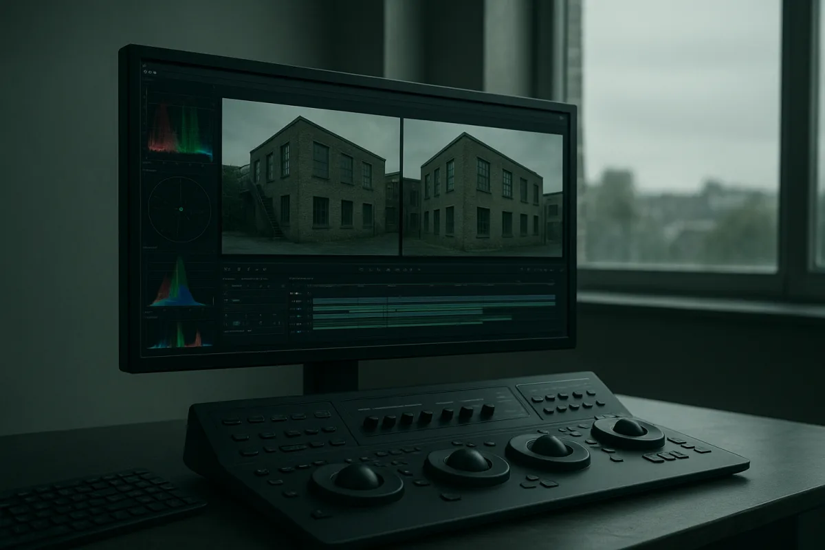
First, find out whether the problem is in the footage or the timeline
Most grading mistakes arrive before the grade. The editor sees a flat image, adds contrast and saturation, then discovers later that the camera was using a log profile, the project was set to the wrong colour space, or a proxy is not representing the original correctly.
Before picture lock, inspect a few representative shots from every camera: daylight, mixed-light interiors, skin close-ups, dark material and bright windows. This is not the creative grade. It is a quick technical check that identifies problems which will otherwise multiply across the edit.
Colour grading properly belongs after picture lock and before final delivery. Primary correction comes first, including exposure, white balance and contrast. Secondary work, shot matching and the creative look follow that technical pass. [2][18]
That sequence matters on deadline. If the edit keeps changing, do enough correction to make editorial decisions safely, but do not spend hours polishing a scene that may lose half its shots. A complex 90-minute narrative grade can be estimated at roughly 225 hours, or 11.6 weeks. [19]
That figure is not a universal booking rule, but it explains why rushed grades go wrong. A post-production schedule that treats colour as a final afternoon encourages blanket LUTs, unexamined exposure errors and inconsistent scenes. Underestimating the grade risks a visibly weaker result. [20]
Fix the proxy problem before grading from the wrong image
A proxy workflow is mainly an editing workflow, but it can create colour mistakes when the proxy is too compromised to judge framing, exposure or skin. The useful baseline in the available research is 1080p proxy media for 4K and 6K originals. [13]
For codec choice, the research specifically recommends ProRes Proxy for smooth, frame-accurate playback. [14] I have not tested alternative proxy codecs or proxy resolutions for this guide, and the supplied research does not make a supported comparison between them.
Keep the proxy’s colour depth consistent with the original media where possible. Reducing colour precision can create a mismatch between what editorial sees and what the finishing session reveals, particularly in gradients, shadows and saturated practical lights. [14]
Do not grade the proxy as though it is the camera original. Use it to make safe editorial choices, then confirm the correction and look against relinked original media before final approval. The sources support colour-depth preservation as a safeguard, not a claim that every proxy will look identical to its source. [14]
If a shot suddenly changes after relinking, stop adjusting creative controls. Check whether the camera source, timeline colour handling and proxy generation settings are aligned first. Most apparent “bad grade” problems at this stage are workflow problems, not a reason to buy a faster workstation.
Correct exposure and white balance before making it stylish
The first visible error is often a grade applied to uncorrected footage. Skipping exposure and white-balance correction before creative grading is a well-established route to inconsistent, artificial results. [2][3]
Start with exposure. Look for clipped highlights, black areas with no recoverable separation, and shots that simply sit at different brightness levels within the same scene. Do not begin by adding a teal shadow or warm highlight split to footage whose basic luminance is still wrong.
Then correct white balance. Automatic white balance regularly fails under mixed lighting, leaving casts that become more obvious when contrast and saturation are added. Manual white-balance and exposure correction is the recommended response rather than trusting AWB to solve a difficult location. [16][17]
Mixed lighting is particularly unforgiving. One study cited by Frame & Focal found that 89% of mixed-lit portraits showed colour shifts greater than 120K in shadows. [15] That is a warning to isolate the problem area, not evidence that one global temperature adjustment will fix every frame.
If faces are warm under one fixture and backgrounds are green or blue under another, establish a sensible overall balance first. Then use secondary correction only where it solves a specific visible issue. Trying to neutralise every light source globally usually trades one cast for another.
There is no defensible universal recipe such as “move Lift by this amount” or “set saturation to that number.” Available guidance says Lift, Gamma, Gain and saturation values depend on the footage and intended result. Use controls to reach a measured image, not a memorised value. [9][10][11]
Stop trusting your eyes alone, use waveform and vectorscope
A screen can lie, especially when its calibration is unknown or you have stared at the same sequence for six hours. Waveforms and vectorscopes give you a repeatable way to identify the two failures editors most often miss: crushed shadows and clipped highlights. [4][7]
A waveform displays luminance from 0 to 100 IRE. It lets you see whether blacks are being pressed into a featureless floor or highlights are pushed beyond usable detail. [7] Check it while making primary exposure moves, not only as a final technical inspection.
The vectorscope maps hue and saturation. It is particularly useful when a correction that looks “punchy” has pushed skin, wardrobe or a coloured wall much further than the rest of the scene can support. [8]
For skin, use the vectorscope’s skin-tone line as a verification tool. It does not replace looking at the actor, because lighting and complexion vary, but it provides an objective warning when skin has drifted into an implausible hue. [8]
This is where over-saturation and excessive contrast show themselves. Both are common mistakes because they create a quick impression of polish, while also making skin unnatural and reducing useful tonal detail. [3] If a grade only works with the scope ignored, it probably will not travel well.
Match the scene before you apply the look
Once each shot is technically balanced, work through a scene in edit order. Compare adjacent angles, then return to the first shot after matching the last. The practical goal is continuity, not making every frame mathematically identical.
Inconsistent grading across shots creates temperature shifts that viewers notice even when they cannot describe them. A dialogue scene may alternate between cool and warm faces, or between deep blacks and lifted shadows, simply because each angle was corrected in isolation. [4]
Multi-camera work adds another complication. Different camera sensors respond differently to the same lighting, so matching exposure alone does not guarantee matching colour. [16] Build each camera’s primary balance first, then judge the cut, rather than forcing one camera’s correction values onto another.
Use a representative hero shot as a reference, but do not treat it as a universal preset. A reverse angle may include a window, a different part of the room or a different mix of fixtures. Match the perceived scene, while protecting exposure and believable skin.
Advanced illuminant-adaptive 3D LUT methods may help in difficult lighting conditions. Research cited in the brief reports reductions of about 20% in CIE ΔE00 colour error and 18% in angular error. [1] That is useful context, not a promise that an adaptive LUT will rescue badly exposed footage.
Apply LUTs only after the transform and correction are right
A LUT is not a repair tool. Applying one without the appropriate colour-space transform can produce washed-out images or excessive saturation. [6] This is the common “the LUT looked fine in the thumbnail” failure, now spread across an entire timeline.
Confirm what the camera footage is, what the timeline expects, and what the LUT expects before applying it. A LUT designed for a transformed image should not be dropped directly onto log footage, and a display-look LUT should not substitute for primary correction.
After the transform, apply the LUT gently and compare it against the corrected image using waveform and vectorscope. If highlights suddenly clip, blacks collapse, or skin shifts, back up. The LUT may be unsuitable for that source material or may be stacked in the wrong part of the pipeline.
Over-grading often looks like crushed blacks, blown whites and banding, with an artificial overall result. [5] The fix is rarely another effect. Remove or reduce the aggressive correction, restore the technical balance, then rebuild only the creative changes that survive comparison across the scene.
Do not mix Rec.709 and Rec.2020 assumptions
A flat, grey or strangely saturated grade may be a display-standard mismatch rather than a bad correction. Rec.709 is the established SDR standard and covers roughly 35.9% of the CIE 1931 gamut. Rec.2020 supports HDR work and covers roughly 75.8%. [10][12]
Those standards are not interchangeable. Grading Rec.2020 HDR footage in a Rec.709 timeline, or judging it on an SDR display, can create flat-looking images or oversaturation. [8][10] More saturation is not the answer to a wrong colour-management path.
Set the project and delivery intent early: Rec.709 for an SDR delivery path, Rec.2020 where the project is genuinely intended for HDR and is being evaluated on HDR-capable monitoring. Rec.2020 requires HDR-capable displays for its intended use. [12]
The research supplied for this guide does not provide a supported workflow for Rec.2100, specific NLE colour-management panels, or monitor calibration hardware. That limitation matters. Do not pretend a generic timeline setting is a substitute for a confirmed delivery specification and suitable monitoring.
Check skin, gradients and highlights before export
The last pass should be a problem hunt, not another opportunity to redesign the grade. Watch for skin drifting shot to shot, clipped practical lights, shadows that lose facial detail, and smooth backgrounds that have developed visible banding after heavy correction.
Poor skin-tone correction is one of the recurring grading errors identified in the research. [3] Check it in close-ups, but also in wide shots where warm skin can look acceptable alone and suddenly become too orange against neutral walls or costumes.
Look again at scenes under mixed lighting. Because white balance can fail differently between angles, an edit may look matched at the beginning of a scene and fall apart when coverage moves near a window or under another fixture. [15][16]
Finally, inspect the final output in the delivery colour space rather than relying entirely on the grading interface. Colour-gamut mismatch and improper display calibration are documented sources of grading errors. [1] The disciplined fix is simple: technical correction, scope checks, scene matching, then a restrained look.
Frequently Asked Questions
How do I fix common color grading mistakes in video editing?
Start by fixing exposure and white balance before applying any creative look. Use scopes such as waveforms and vectorscopes to objectively check for neutral corrections and avoid crushed shadows or clipped highlights. Match shots in a sequence to ensure consistent color, especially when dealing with mixed lighting or multi-camera footage. Avoid rushing the grade to prevent over-saturation, over-contrast, or artificial skin tones.
What steps should I take to correct exposure and white balance errors before grading?
Perform primary correction first by adjusting exposure, white balance, and contrast using waveform monitors and vectorscopes rather than relying on slider values alone. This technical pass should be done before any secondary work or creative grading. Use scopes to verify that skin tones and neutral areas are accurate and consistent across shots.
How can proxy files affect color grading accuracy and how to fix it?
Using proxies with lower resolution or reduced color depth can mislead grading decisions by not accurately representing exposure, color, or skin tones. To avoid this, edit with 1080p ProRes Proxy files that retain the original color depth for 4K or 6K footage. Always confirm corrections and creative looks against the original media after relinking to ensure accuracy.
Why does mixed lighting cause color grading problems and how to solve them?
Mixed lighting often causes spectral inconsistencies and color shifts because automatic white balance struggles to neutralize multiple light sources. This leads to inconsistent color casts between shots or within a scene. To address this, match shots carefully before applying a creative look and consider manual white balance correction to reduce shifts caused by different sensors or lighting conditions.
How to avoid grading mistakes when working with Rec.709 and Rec.2020 color spaces?
Keep Rec.709 SDR and Rec.2020 HDR projects separate in timeline settings and monitoring to prevent flat or oversaturated results. Grading HDR Rec.2020 footage in a Rec.709 timeline or on SDR monitors can cause color gamut mismatches and inaccurate color representation. Use appropriate display calibration and project settings that match the color space of your footage.
How we researched this
This article was assembled from 20 cited references.
Nothing here is based on hands-on testing. Where a figure or finding appears, it belongs to the source cited beside it, and the writing says so rather than implying otherwise. Every source is listed below so you can check it.
Sources
- The Past and the Present of the Color Checker Dataset Misuse
- Color Grading: Primary, Secondary & LUTs | BOLD University
- Common Mistakes in Color Grading and How to Avoid Them: A Guide for Video Editors - TechBullion
- Color Grading in Film: A Practical Guide for Brand Video (2026) - LocalEyes Video Production
- Color grading
- Colour grading in videography: a practical guide
- Waveforms and vectorscopes explained - Videomaker
- Waveforms, Vectorscopes, and False Color | Luminxel
- Lift / Gamma / Gain Primary Color Correction · Filmfarm Lexikon
- DaVinci Resolve Color Grading for Beginners (October 2026) Guide
- Free Video Editor 2026 - VSDC Professional Tools for Windows and iOS No watermarks
- What is Rec 2020?
- Proxy Workflows: Edit High-Resolution Footage Without a
- Proxy-Workflow: Offline-Schnitt mit Proxy-Dateien — Wiki | Lazi Akademie
- 5 Critical Color Grading Mistakes That Ruin Professional Images | Frame & Focal
- Why Lighting Looks Different on Every Camera | Harlowe
- You're using white balance on your camera all wrong - stop trying to 'fix' the light!
- Post-Production Workflow Guide for Video Te | Fastio
- Color Grading Timeline Estimator - Free Filmmaking Calculator | Tools for Film
- The Complete Post-Production Timeline | Trisha Studios
Related Articles
Fix Audio Issues in Video: Tips for Better Sound Quality
Learn how to fix audio issues in video with tips on sync, noise reduction, and audio repair for clearer, professional sound in your edits.
Common Mistakes in Video Editing
Learn common mistakes in video editing including timeline setup, frame rate mismatches, and timecode errors to improve your post-production workflow.
Video Editing Techniques for Corporate Videos
Learn effective video editing techniques for corporate videos, including timelines, proxies, codecs, and color grading best practices.
Travel Vlog Video Editing: Workflow, Proxies & Colour Tips
Learn travel vlog video editing with tips on workflow, proxies, colour grading, and pacing to create engaging travel videos efficiently.